Repetitive AI-generated event posters have become visually tiresome, according to designer John Hartnup. The issue isn’t that they’re poorly made—it’s that they all look alike. After seeing the same aesthetic replicated dozens of times, the style becomes irritating through sheer uniformity.
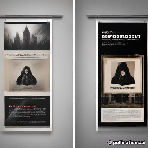
Hartnup set out to demonstrate that AI tools like ChatGPT are capable of producing far greater stylistic variety. He provided the system with event details for a spring fayre and asked for specific design directions rather than accepting defaults.
His initial attempt—requesting “a clean, unfussy, bright layout with a bold striking spring-themed graphic”—still felt generic. But when he asked ChatGPT to try “a completely different design aesthetic,” the results improved markedly. The system produced a Bauhaus-influenced modernist design with geometric shapes, asymmetrical layout, and high-contrast typography. This stood out simply by being different.
When asked to explain its style choice, ChatGPT identified the approach as “Bauhaus / Modernist Poster Design” with elements of Swiss-style grid-based layout and geometric minimalism—a departure from the typical local event poster defaults of bunting, hand-drawn florals, and pastel palettes.
Hartnup then requested a comprehensive menu of alternative design directions, receiving suggestions including risograph print style, cut-paper collage inspired by Matisse, brutalist graphic design, 90s rave flyer aesthetics, Japanese minimal poster design, Memphis design, and others. Each came with concrete descriptions of how they’d appear.
Using these specific style names, he generated multiple variations. A stamp/letterpress style appeared notably different from a Japanese minimal version or a Memphis design interpretation. He even experimented with more unusual directions: a photocopied 1980s punk fanzine aesthetic, a 90s drum-and-bass gig flyer with early 3D imagery, and a design mimicking a professional typographer’s refinement of a child’s poster painting.
Hartnup emphasizes he’s not claiming these posters lack an AI quality—rather, the goal is avoiding the fatigued aesthetic everyone recognizes. By specifying particular design movements and traditions rather than relying on defaults, users can create visually distinctive results that stand out from the homogenized posters now common for local events.
Key facts
- AI-generated posters often suffer from repetitive, generic aesthetics that become irritating through overuse
- Specifying design styles—Bauhaus, risograph, Japanese minimal, brutalist—produces significantly different visual results from defaults
- ChatGPT and similar tools have access to diverse design traditions but default to familiar “craft fair” aesthetics unless redirected
- Named design movements and art styles serve as effective prompts for generating distinctive poster variations