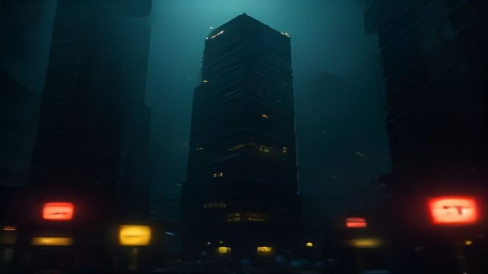
The Blade Runner title sequence uses a single typeface—Goudy Oldstyle—to establish the film’s dystopian mood, according to an analysis of its typographic choices. While the primary goal of typography is often to aid readability without drawing attention to itself, the Blade Runner credits demonstrate how type can convey feeling and set narrative context. The sequence employs all caps for names, proper nouns, and the title, with a slightly larger version for the Los Angeles, November 2019 introduction. Smaller all caps are used for other important words. In the exposition crawl, standard capitalization is applied except for small caps used on proper names like The Tyrell Corporation and a red, italicized version of the word ‘Replicant’ on its first appearance—a color that matches the movie’s title. The crawl is set like a book, with first-line indents and generous word spacing. Notably, the designers letterspaced the uppercase letters but not the lowercase, following Frederic Goudy’s principle that ‘anyone who would letterspace lowercase would steal sheep.’ The sequence also features a distinctive ‘chonky em dash.’ Unlike functional fixed-width typefaces used in coding, where the goal is structural clarity, the Blade Runner typography serves a dual purpose: it is partially functional in conveying story details but primarily focused on establishing mood. The analysis notes that an early work print of the title sequence used Impact typeface, which was described as a ‘clumsy path-of-least-resistance slap-to-the-face choice’ that failed to suit the film’s tone. The final choice of Goudy Oldstyle, by contrast, successfully contributed to the immersive, unsettling atmosphere of the film’s opening moments.
Key facts
- The Blade Runner title sequence uses Goudy Oldstyle as its sole typeface.
- All caps are used for names, proper names, the title, and the Los Angeles, November 2019 introduction.
- Small caps are used for proper names in the exposition crawl, such as ‘The Tyrell Corporation’.
- The word ‘Replicant’ appears in red and italicized form on its debut, matching the title’s color.
- The crawl features first-line indents and generous word spacing, resembling a book layout.
- Uppercase letters are letterspaced, but lowercase letters are not, per Frederic Goudy’s typographic principle.
- An early version of the title sequence used Impact typeface, which was criticized as unsuitable for the film.
- The typography in the title sequence is partly functional but primarily serves to establish mood.